It's more about overall look and feel, which in large part comes from the glyph proportions (the x-height), spacing and weights - https://i.imgur.com/mygqn3H.png
Glyph proportions between Whitney and Nebula are almost identical. As are their weights. Source Sans is substantially heavier and more dense looking.
While individual glyphs may be closer between Nebula and Source Sans, but the overall feel of Nebula is that of Whitney.
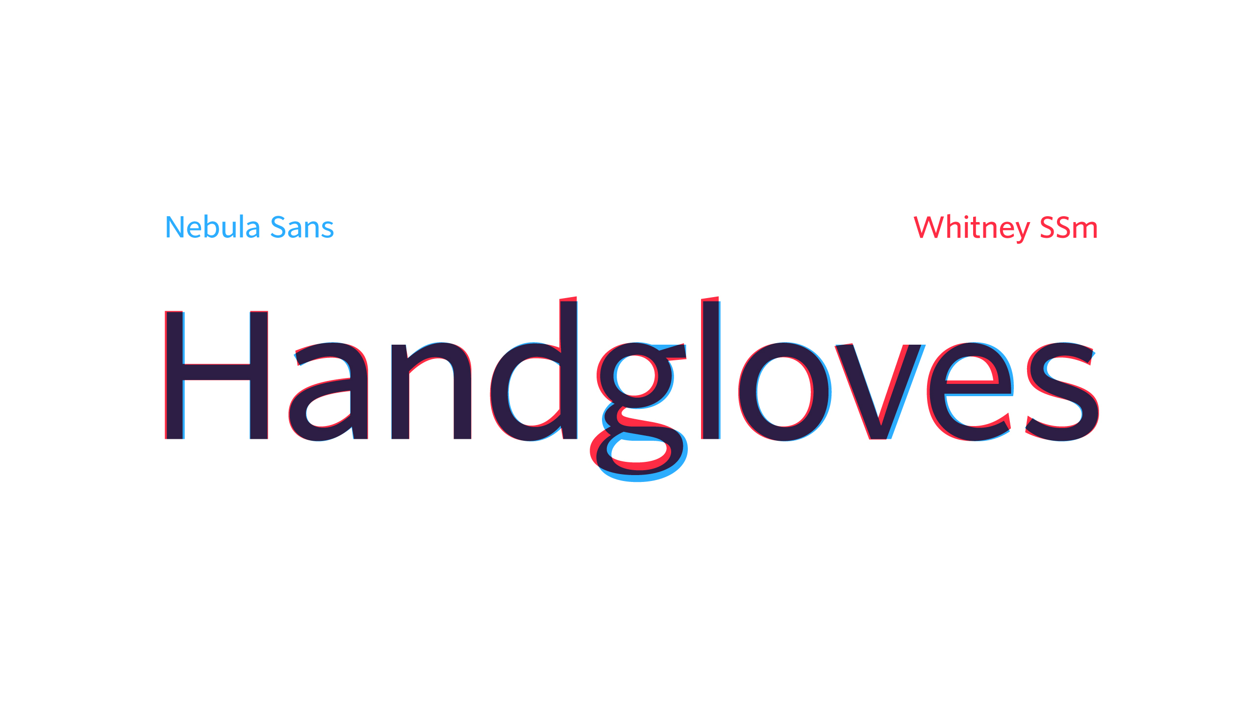
I saw that. Here's a quick similar comparison between Nebula Sans and Source Sans I just whipped up: https://imgur.com/JPwgYkj
It's more about overall look and feel, which in large part comes from the glyph proportions (the x-height), spacing and weights - https://i.imgur.com/mygqn3H.png
Glyph proportions between Whitney and Nebula are almost identical. As are their weights. Source Sans is substantially heavier and more dense looking.
While individual glyphs may be closer between Nebula and Source Sans, but the overall feel of Nebula is that of Whitney.
Failed rebuttal of tobr's clearly true statement. Your own png refutes your position.
So, it's worse than Source Sans because it removed the differentiation between a lowercase L and an uppercase i.
I'd rather use Source Sans then.
Tangentially, there are two versions of Source Sans worth considering afaik:
* the latest OTF
* the Source Sans 2.020 TTF, which is the last version (at least, the last version released in the GitHub repository[0]) that has manual hinting
[0]: https://github.com/adobe-fonts/source-sans/releases
The two typefaces couldn't look more different. Look at the stroke cuts on the ascenders of the 'd', 'l', the stroke cuts on the 'a', 'e', and 's'.
Is there some online tool for comparing fonts that way?
I’m wondering why they’ve added the slanted top on ‘t’, but not the other letters: https://nebula.tv/videos/nebula-sans?t=363