Comment by smcl
8 years ago
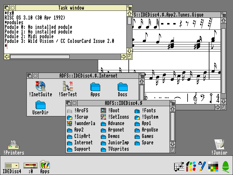
Does anyone know why those chunky, slightly unattractive fonts were so common - even sometimes in the cases of a higher-res screen? A couple of the examples of what I'm talking about...
Here's Risc OS 3.10: http://www.typewritten.org/Media/Images/risc-os-3.10.png
It's an older system with a relatively row resolution but each letter looks (to me) to be stretched vertically (or squeezed horizontally) - if you look at the elements on the windows (like the X or the border on the scroll-bars) you can see that this isn't simply a case of not having enough pixels available
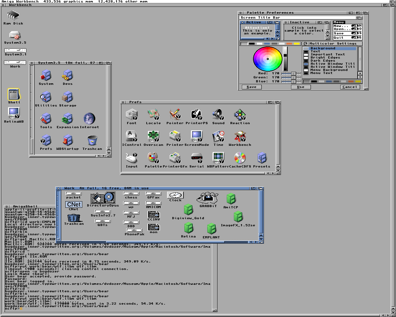
This Amiga Workbench 3.5 one is another nice example: http://www.typewritten.org/Media/Images/workbench-3.5-retina...
The font seems really chunky to me and the environment clearly supports "better" (very subjective, I know)
I missed this era by a few years - maybe someone can shed some light on whether the window systems themselves were impressive enough on their own, or perhaps people found them more familiar (like they stuck around after moving from command-line to GUI)?
I get that I'm coming from an age where we have extremely high dpi screens and font anti-aliasing etc, but I've also worked with 5x7 and even 3x7 fonts (see http://blog.mclemon.io/arduino-5x8-iso-8859-2-font and http://blog.mclemon.io/hacking-a-tiny-new-font-for-the-ssd13...) and the systems above looked like they could support better than this.
Some older computers had weird resolution / aspect ratio combination.
https://www.gamasutra.com/blogs/FelipePepe/20150423/241730/N...
Basically, if you play video games from the DOS era on a modern computer without correcting their aspect ratio they look stretched, and that was not how they were supposed to look.
So, the same goes for fonts. They look weird if you look at it with your current resolution and aspect ratio. They would look more condensed/thinner on the CRT monitors of the DOS era.
> The thing is, most MS-DOS games were actually rendered in 320x200, which is a 16:10 aspect ratio and thus widescreen – but they weren't displayed that way. I won't pretend I know all the technical details – there are way better sources for that – simply put, the CRT monitors back then stretched images to fit the screen.
> The 320x200 image was stretched to fit the entire 4:3 screen, to something close to 320x240. What today we see as a sharp, square pixel was actually a blurry rectangle back then, about 20% taller than wider (the Amiga, Apple II, Atari ST and other home computers all had different resolutions, but the principle is quite similar).
Even if you're lowering your current monitor resolution you're not actually seeing those fonts the way they were meant to be rendered. That's because your monitor will display a native DOS resolution as widescreen. When CRT monitors of the time took that widescreen resolution and turned it square.
There's a lot of understanding about old rendering methods that has been lost in the mainstream. The article I linked also showed how people exploited scanlines to make water look transparent in a very smoothed way. Your LCD pixel grid just doesn't show things the way old low resolution CRTs did.
That's an excellent article - especially the Sonic waterfall/transparency part. Thanks!
> The 320x200 image was stretched to fit the entire 4:3 screen, to something close to 320x240.
Not necessarily close to 320x240. Linearly addressable mode X was 320x240.
Very few games bothered with mode X. Most used the much easier to program mode 13h.
1 reply →
Because the electron gun in a CRT moves primarily horizontally, drawing a thin vertical line was difficult. It would very often come out very blurry, especially on low-end equipment. So font makers often used double-width horizontal pixels to make up for this.
The Commodore 64 font is an excellent example of this kind of compromise.
On a PAL/NTSC TV or monitor you preferred non-interlaced modes like 640x272 which had more vertical resolution than horizontal - so it's just readability. Interlaced modes were hard on your eyes because of the flickering.