Comment by 0_-_0
6 months ago
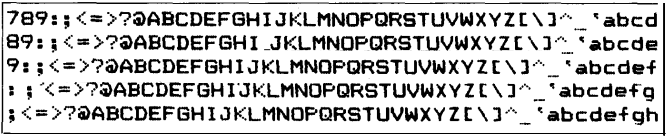
Something isn't right with this, though. I don't remember if there was a "wide" mode, but this font, while it feels very accurate, is somehow stretched wider than what would have been default. Here's an image of something from an MX-80 that looks more like what I remember: https://technicallywewrite.com/images/2024/07/epson2.png (taken from https://technicallywewrite.com/2024/07/01/dotmatrix). Still, thanks for sharing this!
EDIT: Now I know what the issue is! Per the link above: "Like other impact printers, the Epson series of dot matrix printers used a 6x9 grid to arrange the dots for each letter. Dots could also be printed halfway between each vertical line on the grid, effectively providing a higher resolution of 12x9 for each printed character." Here's an illustration: https://technicallywewrite.com/images/2024/07/epson1.png
Ah, so the characters we’re seeing here are twice as wide as they would be when printed? Adding some CSS to compress the page horizontally looks a lot closer to the first image you shared:
The font on the page is definitely too wide -- it should be taller than wide, and 10 characters per inch.
I'm not sure the original MX-80 had square dots. Since they made this to be pixel accurate, the aspect ratio might be off because the MX-80 was off.
The key test is not how it looks on screen, but how it looks printed.
3 replies →
I played with it a bit and 65% or so seemed more accurate to my memories
It was a 1 x 9 print head and you could get 132 characters per line as well as the normal 80, plus variants such as 40 and 66 characters per line, where things must have been doubled up with the motor running at the same pitch, hence the 12x9 you refer to.
I only became familiar with the later FX-80, which was the same but different. I managed to get logos printed along with neat boxes around information from the extra characters it had in PCL.
I am sure NLQ was a selling point of the FX-80 but I would like to see how good it was on the MX-80. At the time printers from Epson, HP and Canon were miracles of engineering, more advanced than the computers they were connected to.
I got the Graftrax option for my MX-80 so it could do arbitrary graphics without having to mess around with special characters.
I usually printed my listings etc. with "condensed" fonts. They looked very nice. Even so, I can't remember that the non-condensed fonts should look that wide, when looking at the web page.. I remember something kind of like that, but not the standard mode.
I have an OKI Epson-compatible matrix printer somewhere in the man cave. The last time I printed anything on one was a Snoopy calendar generated by the Snoopy Calendar Fortran program. If I ever get the mess in the cave sorted out I'll get that printer hooked up again, to something. The 80's mini maybe..
Thanks, I was immediately wondering what was wrong with that web page as I never had such wide fonts coming out on paper.
Never? There definitely was a double-width feature on those printers, as demonstrated in the manual: https://www.apple.asimov.net/documentation/hardware/printers...
I remember my Star LC-10 had multiple fonts with different widths. There was regular, condensed, wide and NLQ (Near Letter Quality). The latter looked like it had been written on a typewriter.
I had a Star SG-10, labeled as "Epson Compatible". (Mostly)
The Near Letter Quality was essentially double struck by making a second pass at a slight offset, with the corresponding increase in noise and print times.
There wasn't support for the printer in AppleWorks, so my first useful program was a BASIC thing that you could set the font in the printer and then reboot into AppleWorks to use either the 10 cpi, 12, 17(condensed) or the NLQ setting.
Star Micronics Gemini-10X to Xetec Super Graphix interface card to C64. The bane of my existence seemed to get the sprockets synced and eventually started wrinkling the paper after a few pages.
Ahh, thank you for solving the mystery. Personally I think they should put some text on this page fixed with CSS to demonstrate this.