Comment by jjcm
4 days ago
Doing testing with it now, specifically for image->html conversion.
Previously Fable was the best at this, followed by Gemini 3.1 pro (a surprising #2, but Google has great vision models).
Opus' results seem to be more accurate than Fable, following the design source of truth better.
Example results:
Design source of truth: https://image.non.io/73e239a3-880f-4793-b65f-4810be2d9378.we...
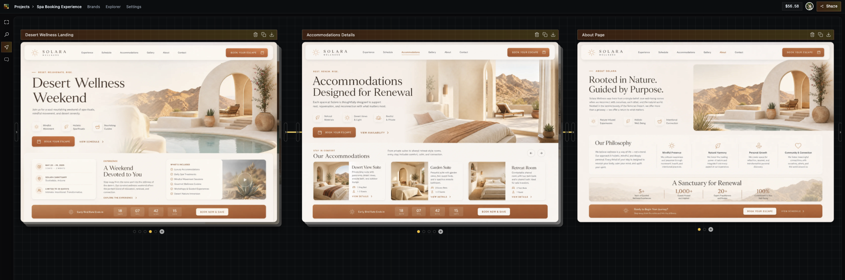
Opus 5 build: https://html.non.io/solaraOpus/
Fable 5 build: https://html.non.io/solara/
Note the buttons - for fable they're pill buttons, opus got the rounded rectangle nature of them. Opus' images are closer to the source of truth as well (both LLMs were provided with image gen capabilities for the assets).
Running more tests now, but preliminary results are saying this is indeed better than Fable in some areas. Crazy.
Here's another test of a cyberpunk ramen shop website.
One thing I've found LLMs have a lot of difficulty with is angular cuts / elements that aren't easily representable with CSS. Cyberpunk aesthetics are generally a great test of that, since they have a lot of microglyphs / window decoration.
Design source of truth: https://image.non.io/9d5fed20-b476-49d3-841b-37eb553fb88e.we...
Opus 5 build: https://html.non.io/neonRamen/
Thoughts: It does a really, REALLY good job at these angular cuts / microglyphs. The responsiveness is off, but I'm very impressed at how well it did here. One way I think of it is "how close to a finished product did this get me?". Opus gets you like 90% there.
Several other commenters have disparaging the design seemingly mostly due to its AI-generated nature, or maybe they actually do dislike cyberpunk.
Personally, I think being able to have these design languages be easily prototypable is fucking awesome. Great tests! (But a tad low-performance/janky, somehow). Though, I also like the cyberpunk aesthetic. Very on-brand(?) that AI generates it, hah.
Just leaving this for anyone that says a design like this doesn't work: https://riceboxed.com/
This is a good version of that design style though
Wish more web looked like this really. Has distinct character.
[dead]
God damn, we are living in the future.
I love this so much.
Designs like this would never have seen the light of day in the cellphone incrementalism / corporate memphis era of tech. Now people can be weird and awesome again.
This is 1980's cyberpunk / late-90's Matrix / early-00's sci-fi UI. Great ideas that died to frutiger aero (which isn't a bad design aesthetic) and flat design (which is).
This is fun and it's got great colors and I love it.
It's so refreshing to see this.
AI rules. This is the best timeline.
What do you mean designs like this? This is 2016-cyberpunk-neon-era inspired by video game interfaces, these are not uncommon at all. Google something like "discord cyberpunk theme" or "cyberpunk rice site:reddit.com/r/unixporn" and you'll find endless examples. This isn't suprising at all obviously.
2 replies →
I feel that AI has deeply diminished my ability to be weird and awesome, because my weird and awesome takes time and the results I can share with others are outshined by the machine.
3 replies →
You should have seen some of the Flash sites people made in the mid 90s early aughts. They all seemed to be straight up screenshots of the desired website and then buttons stapled on random portions.
They were an accessibility nightmare, but you use what you got. I tried so hard as a kid to understand flash, but had to settle on MS Frontpage to publish my first RPG page.
What's old is new again.
Designs are here if you want to play with em: https://diffui.ai/app/canvas/68c5bb3d-467e-4841-b49d-c008e72...
This was just from a prompt "A cyberpunk themed ramen food cart website. Should feature menu, locations, and an ability to put in an order for pickup. Simple and clean website with angular cyberpunk microglyphs, pink/teal colors."
This comment resonated with me so much, and it seems to be a minority view (at least on this website).
I have found myself empowered by AI to tackle all sorts of things that would have too high of a barrier to entry for me to want to spend my limited time on as a busy father who is also working at a small startup.
And when I say that, I do NOT mean that I can crank out a bunch of slop and label it as something I produced even though I don't understand the code. I mean that I can do things like go back to college math that I never appreciated at the time and honestly felt too scared of. I mean having an on-demand math tutor that ask clarifying questions to as I struggle through the problem sets.
I have found that it actually accelerates learning how to code in various problem domains because I can tell it to answer my questions at a conceptual level and be a sounding board, but to never actually write code for me. It can review the code I write and gently nudge me without giving away the answers, so that I still struggle through the learning process and actually gain the knowledge.
And finally, for the first time in like 10 years of feeling overwhelmed and daunted by the prospect of learning game development (I have no background in that), I have found Codex to be an incredible boon for learning with the Godot engine. It helps me understand the terminology so that I know what to search for and what documentation to read. It helps me map my computer science knowledge from other domains into the game world, and to understand why things are structured the way they are. And because Godot saves all of the scenes and geometry and lighting and shaders to the file system as text files, Codex can inspect the results of the work I'm doing in the IDE and help me track down things I'm stuck on, and explain what the issue is. For example, why my pre-baked global illumination lightmap is breaking my ambient lighting configuration.
I know it has never been easier to cheat and skip the hard work that results in actually learning something, but for me, personally, I cannot believe the incredible value that $20 a month has provided me. I have never been more excited and eager to dive into tackling hard things I had previously been afraid of or simply too overwhelmed to attempt.
It has never been easier to quickly prototype and get a feel for some idea you have in your head to see if it even has legs. Simply seeing a quick prototype of an idea is often all of the excitement and fuel I need to then take it and make it a real project.
1 reply →
We are going through yet another generational wealth transfer and people are being squeezed to the absolute brim with layoffs and daunting lack of career prospects.
But sure, lets cheer that funky website designs are back on the menu…
11 replies →
No we are not living in future. Design is ugly, and immediate put off because it smells AI.
11 replies →
I feel you. I dig this and enjoyed those types of aesthetics. Back in the day this was my bread and butter, designing UI design for games and apps. I just realized AI (Specifically Pi+Ornith) can help with my ideas... So excited.
I'm hella interested in finding out what website builder/diagram app was used. I dig the dark theme/grid.
Youre delusional fella.
The reality is the web is going to turn into a walled garden.
It reminds me of the limitations of early CGA and EGA, which isn't a positive.
It's just remimagined LARPing of ppl who were born late into Postcyberpunk.
The same shit like (pseudoretro?) 'Synthwave', äckshuälly.
Because they're incredibly ugly
2 replies →
Unrelated question, what’s your favorite flavor of Kool Aid?
The last 10% is gonna take 90% of the time though.
I really like that design. May I ask the name of the website builder/diagram? Is it Relume?
This is my own tool, diffui. Thanks, though I will say I spent like... 7 minutes on this. Feel free to completely lift the design or the implementation.
I was curious to see how open weight models would do on this task so I passed in a screenshot of your source of truth and here's what 2 of the best code-generation models that allow image inputs do:
Inkling (not too great): https://cdn-uploads.huggingface.co/production/uploads/608b8b...
Kimi 2.7 (really well, esp. note that this is the predecessor model, not the latest Kimi3): https://cdn-uploads.huggingface.co/production/uploads/608b8b...
Here's how I tested them: https://huggingface.co/spaces/abidlabs/vlm-screenshot-to-web...
https://huggingface.co/spaces/abidlabs/vlm-screenshot-to-web...
Not bad at all, and this is pretty consistent of what I've found from the current open source models. I haven't tried it with kimi 3 yet, that's on my todo.
This is an awesome test! Thanks for sharing the results. Opus 5 is very impressive.
Out of curiosity, what app is that Design source of truth screenshot from?
That's from my own tool. I left figma to build a diffusion-based UI tool. Here's a show hn post with some more info: https://news.ycombinator.com/item?id=48995754
Edit: Generation was down, back up now. Apparently just hit my $1000 cap for the openai api. Upped it to 10k. Growth!
Huge fan of the non-seat/monthly based pricing. Do you need it to be higher to not just cover costs but also make a profit?
1 reply →
Your tool looks great!
I just clicked your links and then read your comment after - my first impression was the Fable version looks way nicer.
I agree the fable version looks nice - the rounded hero image for instance.
Opus though followed the source of truth better imo. The details are more present.
Fable filled in the gaps for things it wasn't able to do (ie in the design the hero image goes behind the nav), which resulted in a better looking page that was more divergent.
Same. I like the Fable version better. Better colors, better choice of font sizes, better column sizing. Also small things like the “Experience” section header being orange rather than gray, which Fable got right and Opus got wrong.
It seemed to me that Fable meaningfully improved on the original design more than just faithfully executing the original design.
I liked the Opus version better if only because the responsiveness is less broken.
IMO a much better test would be designs that aren't AI to begin with. Much more useful to see how well a model can html an image design without slopping it up
Very interesting that Fable took more creative liberties. Have you tried giving Fable the same task, but also specifying that it implement a pixel-perfect design? I think that I prefer the Fable implementation. I find the UI elements in the Fable implementation to have more contrast, which feels more usable to me. I also like how the right padding on the "Book Your Escape" CTA in the upper right matches the top and bottom padding, which I think is an improvement over the mockup.
All of these are using a build skill which specifies rules for building it, requirements to create a pixel perfect implementation, and tooling to help in that process. Here's the build skill / instructions I pasted in to both of them:
> Create a web page implementation from the following instructions:
> https://diffui.ai/build/Spa_Booking_Experience_build.md?auth...
> You are an elite frontend engineer and design-to-code specialist. The design image is the primary source of truth; your code is the translation layer. Do not reinterpret or "improve" the design into something generic — reproduce it faithfully.
Thank you for sharing this. I was just using OpenAI's Product Design plugin[1] to create designs but it just didn't reproduce it in code faithfully so will need to try this.
[1] https://openai.com/business/plugins/product-design/
1 reply →
> Doing testing with it now, specifically for image->html conversion.
I wonder if there exists a benchmark for that.
Is this with browser tooling attached to the agent for review/iteration?
yea this was just straight into claude desktop / its standard tool usage, on "high" thinking. The ramen website is on "extra" thinking.
Please share your prompt to convert image to html!
Shared here: https://news.ycombinator.com/item?id=49040344
[dead]